Published on June 2, 2014 By Island Dog In WinCustomize News

Well half the year is done, and if you didn't notice over the weekend, June is finally here.  That got me to thinking what’s been going on so far this year on WinCustomize, and what we can try to accomplish in the remaining part of the year.

Back around March, we had a very successful community project done called Metall Tech.  After a rough start while trying to pin down the main skin, it all worked out and the authors here stepped up as usual and finished a beautiful suite of skins.  You can see the full list of them and more on the project here.

I wouldn’t mind getting another community skin going sometime in the next few months, so I’d really like to hear your thoughts on that and suggestions on what the skin might be based on.  Speaking of projects, DrJBHL had a great idea for another community project and even came up with a cool mockup. This isn’t so much a skinning project, although we could turn it into maybe the next type of community wallpaper.

Here’s a mockup.
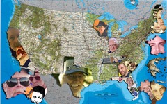
Composite Map 2

Basically, it’s a map where people can submit their pictures or logos along with where they live in the world and it the image can be placed over where they live.   Again, let us know what you think about something like this.

Finally, I’d like to have some type of summer contest in the next few weeks.  Not sure of any details as of yet, but it’s always fun and gets people involved, so that’s always worth the effort put into it.


Comments (Page 2)
2 Pages1 2 
on Jun 02, 2014

Here is a thought. How about taking the 4 time zones and making a full size image out of each. May be able to get plenty of pictures on each zone. The main image could be a nice picture of the US with 4 different links to each zone. Also we have many members from other Countries. Could have maps of those Countries and links added to the other 4 US zones. Don't see a problem with clicking links to see where the members are from and who we are seeing when we are making comments, on threads, graphics and more.

on Jun 03, 2014

DrJBHL
4. RedneckDude reply 14 "It was a simple, and very pertinent question."
Bullshit. It was a repetition of a question above it. It was negativism. You couldn't even be bothered to read the comments above your brilliance.

OK, Doc. You win. So, I overlooked some of the other statements.


Your comments to me borderline a personal attack and I am not crazy about your tone.


Yes, I overlooked a few comments. Get over it.

I will state my opinion on this site as well as the next guy. I have the right to be wrong, and I have the right to reply.

I am done here.

Forgive me for asking a question. Even if it had already been asked.


JEEZ.

on Jun 03, 2014

I think snowman's got a good idea using the pins and avatars. Plus DT1's idea of a zoomable map. Like Google Earth only better 'cause the community itself  is represented. I say go this way if you guys want. There are some interesting world maps in Google images.  

2 Pages1 2