Microsoft has introduced the new corporate logo.  The last time this was updated was 25 years ago, and comes in line with the Windows 8 design.

What do you think?
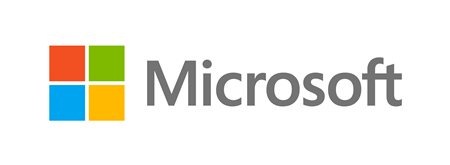
microsoft_logo

http://blogs.technet.com/b/microsoft_blog/archive/2012/08/23/microsoft-unveils-a-new-look.aspx


Comments (Page 1)
3 Pages1 2 3 
on Aug 23, 2012

Bland.

on Aug 23, 2012

pukesthetics galore

on Aug 23, 2012

Bland.

Sums it up for me as well.

on Aug 23, 2012

Bland.

Yep.

on Aug 23, 2012

Ridiculous!

on Aug 23, 2012

Metrosoft

on Aug 23, 2012

wow....4 colored boxes and the word Microsoft.....I'll bet it took them weeks of brainstorming to come up with that one.   -- Ace --

on Aug 23, 2012


on Aug 23, 2012

AceMatrix
wow....4 colored boxes and the word Microsoft.....I'll bet it took them weeks of brainstorming to come up with that one.   -- Ace --


Yeah, and like the dummies they are of late, they probably paid some company $50,000 to come up with it!

on Aug 23, 2012

 meh

on Aug 23, 2012

constructed, hard, uniform, unbending, solid,  no free flowing lines,  no modern round soft shapes or good feel colours  ... as Jafo said 'Bland'

Big risk linking a logo to a non proven product ... you should only change your logo if you are trying to reconnect to the customers and want to repackage your company ... would be ideal for a company which makes kids colour blocks, and they would use bright happy (not old man safe) colours.

Now I look at it, it doesn't have any active elements creating movement ...

on Aug 23, 2012

They should have used the Windows7 flag.  It is the last known good configuration.

on Aug 23, 2012

Past logos: 


It's less bland than the last one.

on Aug 23, 2012

The letters are still in the correct order. That's something to be pleased about.

on Aug 23, 2012

Clearly they should have asked VStyler to do one for them.

3 Pages1 2 3