With the release of the beta for Stardock Tiles I wanted to write a quick getting started guide on some of the basic features of the app.  I have been using Tiles for a while now, and it’s another one of those must have apps that resides on my desktop daily.

https://www.stardock.com/products/tiles/

What is Tiles?

Tiles is an application that lets you easily manage running applications and windows with a customizable interface that resides on your desktop.  Many of us are used to switching windows via the start menu, but that can become difficult with lots of apps open, especially with apps with multiple windows or documents that you might be working on.

3-9-2011 3-14-37 PM

Using Tiles

Tiles is very easy to use and within just a few uses you will be breaking the habit of using the taskbar for running applications.  Tiles has pages like Apps, Webs, etc. that will display the applications running for that category of app.  Switching between pages is done by swiping left or right.  The display windows in Tiles are live previews, and you can quickly select and bring to focus any window that is open.  Click the window within Tiles to minimize and maximize the windows as well.  All the options for Tiles can be accessed by right-clicking in the Tiles interface.

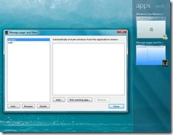
You can customize your pages further by creating your own filters.  You can set specific applications to be open in your pages, and pick running apps to be included that are already running.  Another feature is holding down the Shift key and dragging a window into Tiles.  I usually do this with apps I have open for a short time and use it to keep them organized in a custom page I have setup.
3-9-2011 3-22-35 PM

Is it Skinnable?

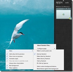
Of course it is!  Tiles has several skins included to get you started, and even includes a skin editor to help you build your own custom skins.  If you are a WindowBlinds user it will also match the skin you are using so everything goes “together” on your desktop. 
3-9-2011 3-41-40 PM

So that was just a quick overview of Tiles, but there is much more to explore.  Check out the demo video below to see Tiles in action and let us know how you like it!


Comments (Page 1)
2 Pages1 2 
on Mar 10, 2011

Taskbar 2.0?


on Mar 10, 2011

Better...W A Y  better than that, 

on Mar 10, 2011

How about filtering apps we DON'T want in there? I've got some processes that are showing up (like web servers) that really don't need to be in there.

Loving it so far! Great work, as always!

on Mar 10, 2011

I love the concept.  Love the skinning.  Love the concept of a built-in skin editor.  Just one question...When are you guy gonna implement skinning in Fences?  I've been dying to wanna customize fences!!! (Beyond just the color and transparency)

Oops, I may be wrong.  Does Fences Pro have skinning?  (I have the free one)

But anyway, great job.  I've been waiting for a while to see what Stardock would do next.

on Mar 10, 2011

Oh, and BTW, nice "Sidebar" killer.  We finally have a nice use for that empty space now.  (This program instantly reminded me of Vista's Sidebar, because of it's positioning.  That's why I said that.)

on Mar 10, 2011

And yes, there will be a gallery on WC for Tiles skins.

And it's here already!

https://www.wincustomize.com/explore/tiles


on Mar 10, 2011

Under "apps" there is the browser too. 

So it's under "apps" and under "web". weird 


...but it's a great program. i love it. and you can match the current system skin, that's fantastic. great work Stardock. 

on Mar 10, 2011

Big thanks for not leaving XP in the dust.    I checked the system requirements fully expecting just Vista and 7 and I see XP listed, yay!

on Mar 10, 2011

I just noticed the live preview when I was scrolling up on this page, it scrolls on the preview tile, pretty cool!

on Mar 10, 2011

Yay, still have my object desktop subscription, can try it out.

Thoughts:

  • Great concept, especially great for tablets and other touch screen devices, I imagine.
  • Would like to have more Windows 7 like features, like pinning and the little controls on the previews.
  • I have never been fond of the Start menu. Never, to be honest. IMO this is a start to perhaps replacing the thing.
  • I don't like the way it snaps when I drag the mouse - it always snaps to the item left of the one I'm switching to, not the one I want to switch to. The item that I've dragged to the center should be the one that receives focus.
  • Love the live preview! Just like Windows 7 - I'm sitting here watching things happen in WoW as I am typing this.
  • You REALLY need to push to get this onto all new Windows 7 tablets, you really do!!!!!!

Still needs some work, but a cool concept and a great start .

EDIT: Bug - when it's on the same side as the taskbar, they overlap instead of being next to each other.

on Mar 11, 2011

Gah, my OD sub ran out.


on Mar 11, 2011

Another bug: Fences doesn't resize.

WANTED: Filter by menu title. Some processes (ie, javaw.exe) are generic containers and can host more than one appication type, and I'd also like to filter out the "games" window in Explorer to go into my "games" tile.

on Mar 11, 2011

cool I will have to check it out

on Mar 11, 2011

I have opened a beta feedback thread so issues can more easily be contained.

https://forums.wincustomize.com/406271


on Mar 12, 2011

Gah, my OD sub ran out.

Mine too, ran out in January... and the bastard power company ensured I won't be renewing it any time soon.   I keep cutting back on consumption by turning as much unnecessary shit off as possible/running energy efficient appliances and globes, etc, but the effing bill keeps getting bigger and bigger every quarter.... almost $700 this time.  Gawd help me/us when the carbon tax hits.

Hopefully, though, in a couple of months.

2 Pages1 2