Enhance the Start Menu and Restore Classic Functionality with Start11

Get into the Beta

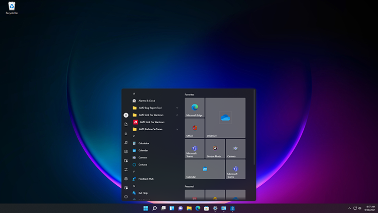
Stardock announced the availability of the Release Candidate 1 update for Start11, a program that allows users to customize the Windows Start menu and taskbar. This update brings several new Start menu layouts to choose from, restored context menu functionality, enabled repositioning of the taskbar, plus one of our users’ favorite features: Fences integration. As with previous editions of StartX products, Start11 allows users to restore the Start menu to appear as it does in previous versions of Windows, as well as customize and enhance its functionality.  
Start11
Start11

Start11 is designed for Windows 11 and Windows 10 and comes loaded with features intended to make Windows more productive and personal. Start11 supports moving the Start button to the middle or to the left, adjusting the taskbar size, re-ordering quick access shortcut lists, options for adjusting grid spacing, enhanced classic and modern search experiences, and much more.  

For users who want to personalize their Start menu, Start11 offers robust customization options ranging from aesthetic to functional. The software enables enhanced Windows 10 and Windows 11 style Start menus, a compact Windows 7 design, optional Windows 11 style for classic menus, and many additional settings that let you configure your personalized Start menu.  

Start11 extends this to support a host of new Start menu ideas such as the concept of pages, minimalism, and features for our enterprise customers.

Start11
Start11

The Start11 beta is currently available for $4.99.
Get into the Beta


Comments (Page 2)
3 Pages1 2 3 
on Oct 09, 2021

1nsomn1ac

tried it & get back to start10 right away due to these:


i don't think it's recommended for win10 users

I have the same problem on Win10. I have it to show 6 shortcuts on the left side and I still have 10. I have the shortcut icons set to Tiny. Using Curtains not WB.

on Oct 09, 2021

ALMonty


I have the same problem on Win10. I have it to show 6 shortcuts on the left side and I still have 10. I have the shortcut icons set to Tiny. Using Curtains not WB.

i used the very minimum (3 shortcuts) and still get that huge empty space.
i just hope stardock fixes it.
for comparison, with start10:

on Oct 10, 2021

Neil Banfield


Quoting c242,

The main showstopper for me is, that You can show shortcuts as link only, no menu.

Pages are great!

Will shortcut menus work in the final version?


We were not sure anyone would want that given that popout menus have never been a feature of the Win10 or 11 menus.


Now that quick links are gone in Win11, this could be a real life saver if we can have 'as a menu' rather than 'as a link only' for certain menu options. 
It would mean the world to have this function added in if its not too much of a challenge


on Oct 12, 2021

JanOscar

One thing though: Is there any way to hide the blue settings icon in All Programs? I seem to remember deleting it in Start 10 created a lot of strange errors.

Hide or at least change the icon? Anyone?

on Oct 12, 2021

JanOscar


Quoting JanOscar,

One thing though: Is there any way to hide the blue settings icon in All Programs? I seem to remember deleting it in Start 10 created a lot of strange errors.


Hide or at least change the icon? Anyone?

The shortcut exists in the program files groups and Start11 shows whats physically there.

You may be able to right click on it and change the icon for the shortcut.  Deletion may also work but be warned it may come back with windows updates, or setting it to hidden will probably do the trick too.

on Oct 12, 2021

It's not the end of the world, but the shortcut is not needed and trying to change the icon gives "Access denied" and right clicking the file and looking at properties has no check box for "hidden" or "read only". Deleting the "Settings" (Immersive control panel) shortcut put all my Fences shortcuts in the All Programs root menu and the menu for Control Panel in right panel gets empty and possibly other errors too since the start menu gets slower and do not work as smoothly as before. That's why I asked.

on Oct 14, 2021

A simple "sorry, we can't help you with that" will suffice.

on Oct 14, 2021

It works fine so far, well done!

The Windows 11 (with the wonderfully large amount of room for the icons!) and Windows 10 Style you've added are great, but could we please get an option to switch out the All Apps with classic "All Programs" start menu folders and items instead?

For example, if you click the All Apps button in the Windows 11 Style Start menu, instead of the Windows 11/10 style alphabetical apps listing I´d like to see the Windows 7-Style "All Programs" list with folders, sub-folders and shortcuts instead. Same on the left side of the Windows 10-Style start menu. Would that be possible as an option for those of us who like the Windows 11/Windows 10 style but dislike the alphabetical apps list and wish to keep their start menu organized with folders and sub folders like in Windows 7 and older.

That would make it perfect and I'd gladly more licenses to equip all the PCs in the household with Start11.

I realize It might be easier to do this for the Windows 11 style, so I'd be happy if just that was updated with an option to enable the old start menu folder list instead of the All Apps list. Both Windows 11 and 10 Style would be even better, of course.

Keep up the great work!

on Oct 14, 2021

JanOscar

A simple "sorry, we can't help you with that" will suffice.

Microsoft made it hard to delete that shortcut it seems.

Right now there is no setting in Start11 to hide that and Start11 will show any shortcuts that are not hidden.

on Oct 14, 2021

Neil Banfield

Microsoft made it hard to delete that shortcut it seems.

Right now there is no setting in Start11 to hide that and Start11 will show any shortcuts that are not hidden.
Thank you, Neil.

on Oct 14, 2021

Are there any release notes for version 0.91 that went out today?

on Oct 14, 2021


And will we get rid of the dark style inconsistencies?  


This would definitely break the deal for me. I hate inconsistency.


on Oct 14, 2021

whistlerpro

Hi all, just bought Start 11, great product! Having only just scratched the surface just a couple of questions...

Start 11's Win 11 style start menu is significantly wider on my Surface Book 2 than the regular Windows 11 start menu... will we get an option to tweak the width? I can see the appeal of a wider menu, but would like to be able to keep it compact. 

Secondly, the in-built search seems to use Bing, which is ok I guess... but any chance we can get an option to change this to Google? For me this would be a big win in terms of making the search more useful.

In a similar vein I think I'd also appreciate a way to hide the search box all together, perhaps with it only appearing if I typed something...?

Thanks!
I also use Google's search engine.  Bing can go bang itself...lol.


on Oct 14, 2021

RedneckDude


Quoting c242,

And will we get rid of the dark style inconsistencies?  

This would definitely break the deal for me. I hate inconsistency.


This is resolved in RC2

on Oct 14, 2021

I just updated Start 11 and still didn't fix Left Hand Short Cuts. I have it set to 6 Tiny and it's still showing 10. No matter what I set it on it's still giving me 10. If I set it to 20 still 10 and the start menu just gets bigger.

Windows 10 OS

Replies 15,16,and 17

3 Pages1 2 3