Microsoft has a huge blog post from the head of the user experience team for Windows 8 about the UI changes and some ideas behind them. It’s long, but an interesting read.
http://blogs.msdn.com/b/b8/archive/2012/05/18/creating-the-windows-8-user-experience.aspx
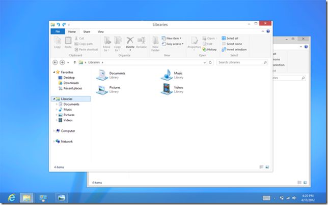
“So what is the role of the desktop in Windows 8?
It is pretty straightforward. The desktop is there to run the millions of existing, powerful, familiar Windows programs that are designed for mouse and keyboard. Office. Visual Studio. Adobe Photoshop. AutoCAD. Lightroom. This software is widely-used, feature-rich, and powers the bulk of the work people do on the PC today. Bringing it forward (along with the metaphors such as manual discrete window sizing and overlapping placement) is a huge benefit when compared to tablets without these features or programs. It is an explicit design goal of Windows 8 to bring this software forward, run it better than in any previous version of Windows, and to provide the best environment possible for these products as they evolve into the future as well.
We see our approach validated time and time again. On one hand, the makers of tablets and phones are in a race to add “PC capabilities” to their devices: support for peripherals like printing, remote access, high-resolution screens, or classes of new APIs for developers that already exist in Windows. At the same time, we also see consumers demanding features in these platforms that have existed for years in Windows—from things as mundane as full support for the keyboard and mouse, to things as complex as support for multiple monitors, background processing, or third-party accessibility tools.”
