Beta for Object Desktop subscribers
Published on August 5, 2009 By Island Dog In WinCustomize News

Stardock is excited to announce the release of Beta 2 for WindowBlinds 7.  WindowBlinds is an application that lets users change the look and feel of Windows XP, Vista, and now Windows 7 by applying themes (also known as skins).  This latest beta release introduces a wide range of improvements and features over earlier betas. 

This beta 2 update includes:

  • Live previews.  See the changes you make in settings in real-time
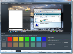
  • Completely new user interface which includes grab and throw scrolling, reflections, and a simpler layout.
  • Improved Windows 7 support
  • Improved skin coloring (see video)
  • Improved sub-style selections, and skin search
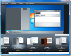
WB_Visual_Styles_Corporate 8-5-2009 1-53-43 PM
 New UI Skin coloring 

WindowBlinds 7 – Beta 2 is available for download via Stardock’s Impulse for Object Desktop subscribers.  Purchase WindowBlinds 6 now, and you will get the upgrade to WindowBlinds 7 for free when released! 

For more information, please visit www.windowblinds.net.


Comments (Page 3)
8 Pages1 2 3 4 5  Last
on Aug 05, 2009

[quote who="I.R. Brainiac" reply="3" id="2327574"]The skin recolor does work well for some skins...just not mine. Needs save button.(.WBO file)
[/quote]

In the future the skin author will be able to specify the default values for the two auto sliders.

Regarding saving colours, the plan is to allow saves in the future.  The UI is not fully complete yet.

on Aug 05, 2009
What a waste of time this whole adventure was for me. I just got a new computer with Windows 7 OEM installed (I am in the business). It won't let me install Windowblinds 6 because it is not compatible. I have no option for Windowblinds Beta 1 or Beta 2. So, I guess I am just out of luck until Stardock realizes that Impulse is a piece of crap software.
on Aug 05, 2009

Kelson64
What a waste of time this whole adventure was for me. I just got a new computer with Windows 7 OEM installed (I am in the business). It won't let me install Windowblinds 6 because it is not compatible. I have no option for Windowblinds Beta 1 or Beta 2. So, I guess I am just out of luck until Stardock realizes that Impulse is a piece of crap software.

You need to tick show prereleases.  Also ensure you have a current ObjectDesktop subscription.  The product you want to select is WindowBlinds 7 not WindowBlinds 6.

on Aug 05, 2009
Works for me just fine and the interface looks awesome. I was missing the same thing though as IRB as in color saturation and brightness. And also toolbar and animation settings, will they be phased in as well? Otherwise, great job, Stardock staff!
on Aug 05, 2009

Very nice. Is there an option or a way to always have it open with the new interface?

on Aug 05, 2009

bmetelsky
Very nice. Is there an option or a way to always have it open with the new interface?

Click on the WindowBlinds7 Beta Icon that is in your object desktop folder off the start menu

on Aug 05, 2009

Thanks! Works like a charm.

on Aug 05, 2009
Love the new interface! Takes a little getting used to the different orientation, but definitely being re-sizable will help with Netbooks since I have trouble WB6 on it. One suggestion though, its a minor quibble. Is it possible to make an option so it can do a sample screenshot with the taskbar up top (or the side if someone chooses)? Should have asked for this before, but it would make it easier when selecting a skin to use how it looks with the bar up top. I suppose though part of the issue is really with skin creators. Many do not include a taskbar that looks good up top as it does down below. Mainly its due to a design element that when moving the taskbar up top is not properly switched around for the different orientation. So maybe this is a WB problem that it can't produce up top taskbars correctly or its the creators not creating it. Maybe don't need the shot to update, but just people to create skins correctly. I don't know. On a side note, I can't understand why MS designs the taskbar for being down the bottom of the screen. All the menu's for programs are up top, so why not have the taskbar there, less mouse movement. There are pros for being on the side as well I guess, but I just think being up top is far more productive and logical. Great job with WB7, and Corporate is a pretty nice skin as well.
on Aug 05, 2009
I like the new interface, very nice. One thing I've noticed in the WB7 betas is that the explorer background options are missing. Maybe this isn't an option for windows 7 (or just not handled yet), but why is it gone for Vista, where it worked before? Just curious
A cool thing I've found is that, with Windows 7, the command window is skinned again Overall, a very nice upgrade, hope the odds and ends get put back in as it goes along.
on Aug 05, 2009
ok i have rebooted, i have show prerelease checked off.... i have uninstalled windowblinds 6 and 7 and reinstalled and all i get is beta 1... i have been using stardock products for many years and i am a computer tech....something is wrong, im not going to get bent, but eager to try the new interface.... i have no button under the red beta 1 text either
on Aug 06, 2009
I am going to try this out right now, because of the dark UI alone.
on Aug 06, 2009
I use XP and wonder if this release will improve on WB6 when used on XP?
on Aug 06, 2009
I just tried out the dark UI. I like it, but can you change the white tab bar at the bottom to black with bright text? The white background is difficult to read. Question about the new UI: Will I be able to edit specific colours of a skin, still? In the old UI I could fine tune colours of a WB skin, such as the application background and foreground, or the menubar background/foreground (and dozens of others) to create my own substyle.
on Aug 06, 2009
I couldn't get Impulse to update to beta2. So I uninstalled it and reinstalled WB7. And up comes the new interface along with the Corporate skin. Looks good so far. Is it me or is the user icon for the start panel misaligned? The panel skin appears it should be positioned in the center of the 2nd column but the user icon is located to the far right instead. Well, other than that, the new interface and Corporate skin looks amazing. I finally have something to change up the appearance of Windows 7 and this'll tie me over until more of the skins get updated for WB7 and Win7 styles.
on Aug 06, 2009
Great work on this update I love the Corporate skin by danilloOC, I was just wishing for an updated version of iFlex and now we have this. Even better. Nice to see some changes to the wallpaper section, the colour filtering function is really nifty. It would be nice to see that expanded to include wallpaper packs and some sort of wallpaper changer too as with the Windows 7 themes.
8 Pages1 2 3 4 5  Last