Published on December 26, 2008 By Island Dog In OS Customization

ObjectDock is one of my personal favorite applications from Stardock.  It is the best way to organize your desktop, and have quick access to applications.  ObjectDock Plus adds to that the ability to have tabs which can make organizing shortcuts into different section even easier.

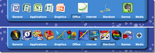
Here is my current ObjectDock Plus setup on my laptop.

  • Stardock tab: Pretty much all Stardock applications
  • Office:  Microsoft Office 2007 applications, Expression Web, Live Writer, and Evernote
  • Games:  All types of games
  • Media: Applications like Windows Live Gallery, Roxio, WMP, etc.
  • Internet: Filezilla, Skype, MSN, Live Mail and TweetDeck
  • Graphics: Photoshop, Corel Painter XI, Camtasia Studio, SnagIt, and more
  • Applications: Parallels, CCleaner, etc.
  • General:  iTunes, Outlook, Browsers, etc.
tabbed_dock

Post your tabbed dock and show us how you are organizing your desktop.


Comments (Page 2)
2 Pages1 2 
on Dec 29, 2008

m1: Thanks for the detailed explanation. I remember seeing this topic in one of WG's threads, and I must say, it left me kinda confused. Thus how I found my workaround.

Your step-by-step instructions made it VERY clear. Thanks!

on Dec 29, 2008

Bryan, in the end, what works for one may not always work for another.  So you have to find a solution that works best for you and do that.  If the way you do it is working for you, don't change.  I try to make it easiest on the user (dockzip would def. be the easiest way, but like I said, certain things don't work the same.)  Basically, with this method, the user has to extract a zip file (which most people know how to do) and then place that folder inside another folder (which most people know how to do)and they're done.  Thanks fer the karma dude.

on Dec 29, 2008

Thanks fer the karma dude.

No, thank you!

on Dec 29, 2008

The reasons I much prefer putting the Plus/Minus images right in the dock backgrounds folder they were made for...is for one...Like Steve said...it's easier than having to change your Plus/Minus images every time you change docks (gotta figure out how to make that work for the weather backgrounds as well)...and two...because I don't want all these extra folders in my "My Documents" folder...I have enough clutter going on in there as it is with all the dock backgrounds and now with all the Winstep/NextStart stuff I have in there now.

on Jan 04, 2009

Bryan, in the end, what works for one may not always work for another. So you have to find a solution that works best for you and do that. If the way you do it is working for you, don't change.

Just changed. Yours and WG's way is easier.

I just set up some tabs this way, and it's much easier, and makes more sense.

Thanks again, guys!

on Jan 04, 2009

Just changed. Yours and WG's way is easier.

I just set up some tabs this way, and it's much easier, and makes more sense.

Thanks again, guys!

We Know! 

on Jan 04, 2009

We Know!

Know-it-all!

on Jan 05, 2009


on Jan 19, 2009

Would anyone in this thread know if there would be a way to have the tabbed docks icons always show the full name of the folder/application?  When in the properties, and under the Size & Appearance section, the option "Entry Names: Show below each entry" doesn't work all that well, because it usually only displays 6-8 letters at most.  So everything shows up like this, "My Docum..."

, "My Compu...", "Shared Do...".

on Jan 19, 2009

Would anyone in this thread know if there would be a way to have the tabbed docks icons always show the full name of the folder/application? When in the properties, and under the Size & Appearance section, the option "Entry Names: Show below each entry" doesn't work all that well, because it usually only displays 6-8 letters at most. So everything shows up like this, "My Docum..."

, "My Compu...", "Shared Do...".

Longer names are not supported very well.  Changing the icons to a smaller size helps, but not much.

2 Pages1 2